Friday, July 24, 2009

Birthday Buddies

I'm having a lazy morning, just scrapping in my pj's with the kids play with their train track!


{white background from "Click." by Kelley Mickus; ice cream paper from MSA Birthday collab by Emily Powers; cupcake paper from MSA collab by Laura Bratcher; orange ice cream paper from "Mrs. C's Confectionary" by Lisa Warren; frame from "3 Ring Circus" by Valerie Brown; stitching from "Maybell" kit by Audrey Neal; alpha from "Doodly Doo Alpha" by Leora Sanford; candles from "Party Time" by Lisa Sisneros; bow from "That's a Wrap" by Kelley Mickus; "Burst My Bubble" font}

xoxo,

Thursday, July 23, 2009

smile.click.scrap.

Woo woo - Kelley Mickus has a new kit! I love her kits, and this one is no exception... you can see the preview of it here.

Here's my layout:


{everything is from "Click" by Kelley Mickus; "Another Typewriter" font}

xoxo,

Monday, July 20, 2009

Happy Halloween (2008)

Today I found these cute photos of last Halloween, and decided they needed a home in my scrapbooks. :)


{background paper and alpha from "Breathe Nature" by Jackie Eckles; stitching from "Vintage Dreams Retro" by Michelle Coleman & Lori Barnhurst; orange paper and date stamp by Kelley Mickus; tree from "Funky Nature" by Tara Dunstan; owl from "The Sky is Falling" by Krystal Hartley; "Pea Jenny Roman" font}

xoxo,

Saturday, July 18, 2009

Just For Fun...

Things have been a bit quiet over at the Digital Scrapbook Memoires forum, so I thought it would be fun to do a little challenge... I posted a new one in the forum based on this layout:


{everything is from the "Tool Time" kit on the "Oh Boy" CD from Digital Scrapbook Memories; "Jailbird Jenna" and "Pea Kristen" fonts}

Come check it out and play along!

xoxo,

Thursday, July 16, 2009

Start HERE

I just had to share this. I found this FREE online "class" at Big Picture Scrapbooking that you can, no MUST, take. I say "class" in quotes because it's basically just a free download full of amazing stuff, so you can just take it at your own pace. It's taught by Stacy Julian, founder of Simple Scrapbooks Magazine (which is sadly no more) and now founder of Big Picture Scrapbooking. I love her approach, and FYI it was actually her book The Big Picutre that really inspired me when I started scrapbooking again after not doing anything for several years. Anyway... the class is amazing. Included in the download are some audio presentations that are incredibly fascinating and completely inspiring. Actually the content isn't very long but it's packed with good stuff. Her whole approach is just so refreshing and after listening I'm totally reenergized and focused on how I want to tell my story.
But enough of my blabbering... go check it out for yourself!

Start HERE with Stacy Julian

xoxo,

Sunday, July 12, 2009

Recoloring Items


As I was creating this layout, I found myself recoloring things here and there so they would match just perfectly. In fact, I do this all the time! So I thought I would use this as an example of just how easy it is to do this, and how versatile it makes any digital paper or embellishment.

First I chose this alpha (from the "Enjoy the Journey" kit at scrapmatters.com). Once I got it opened I realized it was a bit too orange-y:
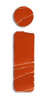
(before)

So, working on my my alphabet layer, I from the drop down menus at the top of my screen, I just selected Enhance>Adjust Color>Adjust Hue/Saturation. In the new window there are three things you can adjust, Hue, Saturation, and Lightness. For this one I just bumped Hue slider a bit to the left until I got the results I wanted, then hit OK to make the change permanent. Easy!
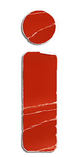
(after)

Next I adjusted the color of this bird - just slightly - because I thought it looked a little too pink.
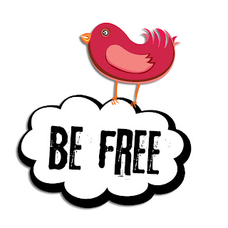
(before)

This one was a bit trickier because I ONLY wanted the pink parts of the bird to change. To select just those parts I use my Magic Wand Tool. This should be in your tool box (on the left of your workspace) in Photoshop Elements and it looks, well, like a magic wand! ;) Your little arrow will turn into a magic wand icon and you can click on any area and it will automatically select the whole area that is like the little spot you clicked on. So, for example, with this bird I clicked on the wing and it only selected the wing that was lighter pink. The tiny part on the edge of the wing wasn't included in my first selection, but when I clicked on that part, it added to the selection. So I just kept clicking on all the areas I wanted recolored until it was all selected. (You can tell what is selected because it's outlined with "marching ants".) Then I go Enhance>Adjust Color>Adjust Hue/Saturation. For this one I just bumbed my hue up a little bit!
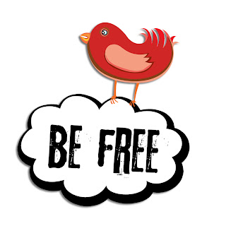
(after)

This next one I did with some help from the Magic Wand tool as well. I decided I wanted the blue button to be red. (This little element is from the "April Morning" freebie at Peppermint Creative).
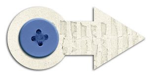
(before)

So I just clicked all over my button with my Magic Wand until it was all selected. Then, as before, Enhance>Adjust>Adjust Hue/Saturation. This time, since the color change was more drastice, I played with all three options. I moved the Hue quite a bit, bumped up the Saturation, and slid the Lightness slider down just a bit. Sometimes it takes a while, but just experiment with the sliders and you can usually get the color you are looking for! Once you do, just click OK. :)

Just another trick that makes digital scrapbook so VERSATILE! Seriously, you could make almost any element from any kit fit into your color scheme. Or, you could be picky like me and just adjust things a teeny tiny bit so they match just perfectly~ ! Let me know if you have any questions!

xoxo,

Thursday, July 9, 2009

Two Page "How To"

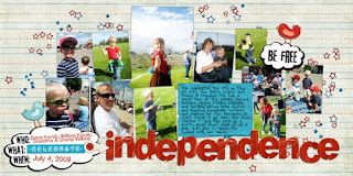
I love a two page layout when I'm scrapbooking a lot of photos. I usually do these for big event pages, like holiday gatherings or birthdays. To make this in photoshop, I start by opening a new canvas that is 24x12 inches. Then I put it all together, always making sure that I don't put someone's face or important journaling right in the center, where the page will be cut.


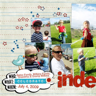
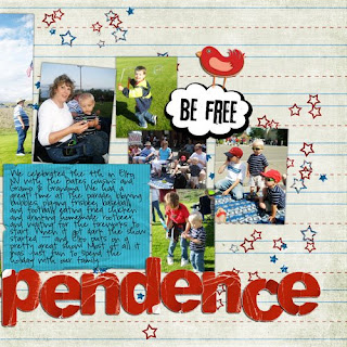
Before printing, I actually crop and save it into two separate pages. I select my crop tool and set it to 12x12 inches, the size of one page. I click and drag from the top left corner, and hit enter to crop. Then I save it, usually giving it a name and then the number 1 (in this case my file name was celebrate_independence1). After the left side has been saved with the new name, I then go Edit>Undo (or hit Ctrl+z... love those keyboard shortcuts) so that my whole layout is showing again. I repeat the cropping process but this time click and drag from the top right corner, so that I can save the right half of my page. I name this one the layout title with the number 2 and save it. This way, I can have them printed separately and I don't have to worry about doing a huge print or trying to cut it myself. Here's a look at the cropped versions:


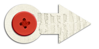
{background paper from "Color My World" freebie by Krystal Hartley; cloud/bird labels from "Tweet Tweet" freebie by RetroDiva Designs; "celebrate" wordart from MSA Birthday collab kit by Dianne Rigdon; cardboard arrow&button from "April Morning" freebie by Miss Mint; red alpha from "Enjoy the Journey" by Dirty Feet Designs; glitter stars from "America Kit" by Redju Designs; blue journaling block from MSA Birthday collab kit by Emily Merritt; "Father Nelson" and "Pea Righton" fonts}

I also recolored some of the elements on this page, so look for a post coming soon about that!

xoxo,

Tuesday, July 7, 2009

Our Hearts Grew

This little layout was created using one of my most favorite kits ever - "Maybell" by Audacious Designs at {we are} storytellers. I also have to give {we are} storytellers a shout out because the reason I got the kit in the first place is pretty cool. I posted this layout (using a different kit also available in their boutique) in their gallery, and shortly after I received and email from the owner of the site saying thanks for telling my story, and here's a little gift card to the boutique! I thought that was so cool, so, here I am plugging their site. They really do have great designers and products and I love their philosopy of keeping the focus of scrapbooking on storytelling. So anyway, that's the story behind the adorable kit that helped me create this layout!


{everything from "Maybell" by Audacious Designs; "Pea Sarah" and "Pea Sarah Cute" fonts}

xoxo,

Another Digi Dare

I did this layout for the latest Digi Dare...


{background paper from "zoom zoom zoom" by Rachel Young; tape photo mask by Katie Pertiet; paint stroke photo masks by Fei Fei's stuff; stamped alpha by Michelle Coleman; cardboard by Gunhild Storeide; branch from "Chance of Rain" by Kelley Mickus; date tag from "May Flowers" by Megan Turnidge; staples from "Vintage Chic" by Jennifer Fox; "Edwardian Script", "Dreamed About You", and "Honey Bunches" fonts}

xoxo,