Friday, March 28, 2008

Inspiration

I was so inspired by this layout. The moment I saw it I stopped everything and spent my morning creating my own version. (Forget the dishes! Who cares about the laundry!)


I will probably frame this little piece of prettiness and hang it near my computer so it can continue to inspire me. This design marries several of my favorite things: a crisp white background, monochromatic hues, tiny repetitive elements, a rainbow, and overall simplicity.

{I'm just going to list the designers in no particular order, HERE WE GO... Digital Scrapbook Memories "Moods", "Flower Patch", "The Garden", "Seasons & Holidays", and "The Playground" CDs; Melany Violette, Leora Sanford, Miss Mint, Michelle Coleman, Gina Cabrera, Lori Barnhurst, Traci Sims, Shabby Princess, Vicky Stegall, Verena Karolyi, AmsDigiScraps, ScrapKuts, Krystal Hartley, Mindy Terasawa, Tricia Cavalcante, Redju, Mary Giles}

Friday, March 21, 2008

Welcome Spring


This page was pretty simple, I just used my own photo for the background and played with the opacity a little bit. I also played with the opacity on the title, date, and flower brushes. I like how it gives it a light, spring-y look that goes with the theme of the page.

{flower and brad from Digital Scrapbook Memories "Moods" CD, staple cluster by Lori Barnhurst and Little Dreamer Designs, brushes from Jason Gaylor's "Japanese Foliage" at Design Fruit, "Impact" and "Typewriter" fonts.}

Thursday, March 20, 2008

Beautiful Mess


This was another challenge from DSM. We had make a layout about some thing we'd like to improve; a weakness; or a pet peeve. Mine is about all the clutter in my house. I called it a beautiful mess because that's often how I feel about my life... it can feel cluttered and unbalanced at times but I wouldn't trade it for anything.

{paper, flowers, brads from DSM "Moods" CD, frame, cardboard, duct tape from DSM "Oh Boy!" CD, stamped journaling lines by Katie Pertiet, label by Amy & Lauren at Polka Dot Plum "Whimsical Wishes" Kit, "One Fell Swoop", "SF Happiness", "Smudgers", and "Harting" fonts}

Monday, March 17, 2008

Try This! Enhancing Photos

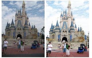
Wanna know I how transformed the photo on the top to the photo on the bottom?? Of course you do! Photoshop isn't just for scrapping, you know...
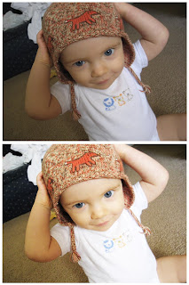


So this is the coolest trick EVER. A huge shout to Brooke for sharing it with Jill, and major thanks to Jill for sharing it with me (and the rest of the girls) on the Digital Scrapbook Memories forum.

This tutorial is for Photoshop Elements. Here goes!

1. Open your photo; here's mine:
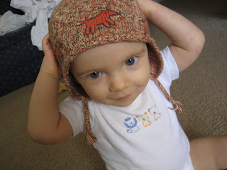


2. The next thing I do with almost every photo is adjust the lighting levels. You can do this one of two ways. A) Click Enhance>Adjust Lighting>Levels OR B) Click Ctrl+L. Either way you'll get the same window. For more information on how to adjust lighting levels, go here. Here's my photo after adjusting the levels:
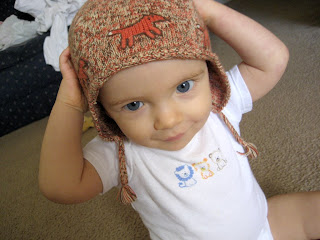


3. Okay, so now here's where we start the really cool stuff. Start by right clicking on your background in your layers palette, and click "duplicate layer" and then click "ok" when prompted.

4. With your new layer selected in your layers palette, select "screen" from you blending modes menu. (This menu is found at the top of your layers palette, and it should say "normal" unless you change it.)

5. Now change to opacity; just play around with it until you find what you think looks good. (The opacity is also found at the top of you layers palette, it will say 100% unless you change it. To change it just slide the little arrow back and forth, or type a specific number in the box.)

6. Merge the two layers (background + background copy) together. This will vary depending on what version of Elements you have. In 5.0, hold Ctrl down while clicking both layers. Then right click on the layers and select "Merge Layers".

7. Now - we'll do it all again! (With some slight differences...) So do the same thing as step 3: duplicate your background.

8. Change the blending mode. BUT this time, select "soft light" from the menu.

9. Play with the opacity again.

10. Merge your layers again, and... VOILA! Here is the lovely result:
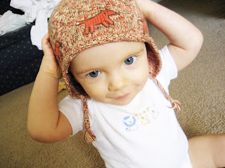


The moral of the story? Even if you don't have the most amazing camera in the world, you can still have amazing photos! Just one more reason why I *heart* photoshop... sigh...
Here's one more example. (Did I mention I love this trick?)
Sunday, March 16, 2008

Two New Layouts...

The first is a challenge I took from the Digital Scrapbook Memories forum. They hosted week three of the Amazing Digital Scrapbook Race, and although I'm not taking part in the race this year (due to a week long vacation I just got back from:)) I did the challenge partly because I don't have many "all about me" pages, but mostly because if we did we were eligible for an amazing prize! I didn't win, but I'm glad I played along anyway. The challenge was to create a page all about yourself, and the journaling had to fill at least half the page. Those were the only rules - but it was tough! So here's the result:


This next page is one I started months ago but got stuck and filed it away for a while. I pulled it out today and finished it up. Both these pages are made using primarily Digital Scrapbook Memories Playground CD.


{Child of God credits: leaves by Katie Pertiet, scallop template from DSM "The Garden" CD, everything else from DSM Playground CD, "Megan's Swingset" kit, "Highland Perk" and "Pea Missy" fonts}

{Clara & Zach credits: everything from DSM Playground CD, "Violet's Clubhouse" kit "CK Ali's Writing" and "Bitstream Vera Serif" fonts}

Tuesday, March 4, 2008

My Favorite Room

I've been wanting to make this page for a while now, ever since I took these pictures a month ago. It was fun to mix in so many different products!


{background paper by Kim Crothers, notebook paper from Digital Scrapbook Memories "Back to School" CD, arrow by Gina Cabrera, green paper stars from by Miss Mint, messy stitches by Fernlili's Digital Designs, buttons from Digital Scrapbook Memories "Oh Boy!" CD, gel star by Michelle Coleman, red ribbon tie by Traci Sims, rainbow by Leora Sanford, star strip by Aja Abney, yellow paper from Digital Scrapbook Memories "Moods" CD, orange bracket by Amy Teets, paint strokes by Melany Violette, red grid paper from Digital Scrapbook Memories "Flower Patch CD, "Impact" & "Lucida Console" fonts.}

Check out that list - phew!

Monday, March 3, 2008

Ordinary Life Album

I love Jessica Sprague. She comes up with the most practical ideas and I am always learning new things - just from her blog! Imagine what I'd learn if I were ever lucky enough to take one of her photoshop classes. Anyway, this is my newest favorite thing she's done: an album called "A Year in Our Ordinary Life." She took two pages for each month, came up with a simple design, and made it into a free, downloadable template for all to enjoy! It's so great because I can now gather all those random, everyday pictures that usually never get printed (and thereby rarely seen or enjoyed again) - and put them together in a few short minutes! All I added was the white paper behind the photos, and I changed the colors of the text and frames. I cannot wait to see the finished product at the end of the year! If anyone's interested, here's a link to her blog post, and that will link you to the download.


It looks much cooler when the pages are side by side, but I couldn't post 'em that way. But you get the idea.

{template by Jessica Sprague, white paper by Leora Sanford}

Sunday, March 2, 2008

Check It Out

My work has been featured here and here. :D