One of my favorite things about scrapbooking with Photoshop is clipping masks. They are super easy and there are so many possibilities. (If you've ever used a layered template, you know what I'm talking about.) I'll explain what it is first, then give some cool examples of how to use it.
As long as you understand your layers, you can do this. Basically all it means is that you can make one layer (usually a paper) take on the form of another layer (usually a specific shape). Clear as mud? Let's say I have this:
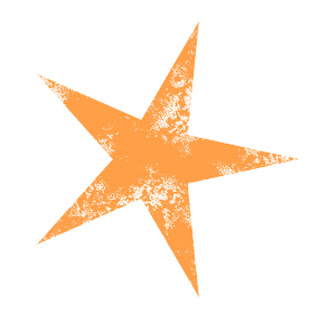
A simple orange star, with a stamped effect:
 {orange star from Gina Cabrera's "Lucky Star" kit}But for whatever reason you like this pattern paper:
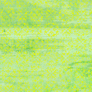
 {paper from Aja Abney's "My Wish For You" kit}
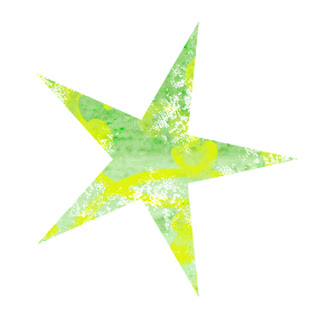
You can "clip" them together to create this:

To do this, put your star (or whatever it might be) and your paper onto your canvas. You must make sure that the star (or layer you want your paper to be "clipped" to) is just below the paper. Then click on your paper layer (above the star). Simply
press Ctrl+G and voila!
Alternatively, you could also go to the top of your screen and click
Layer>Group With Previous to achieve the same results.
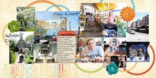
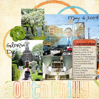
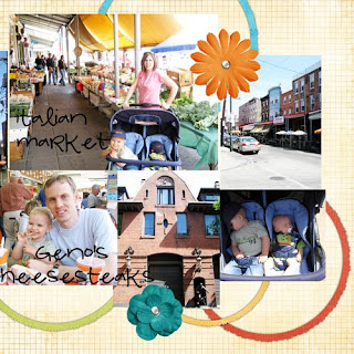
Here's a layout I recently did where I used this technique in a couple of different ways.

It's a two page layout, you can see them a little better separated:


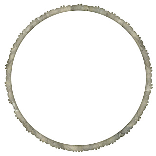
So, clipping masks. First of all, I used this little circle frame:
 {frame from Thanty Borges' "Antique Frames vol. 3" at ScrapKuts}
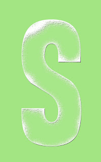
As you can tell, I duplicated it several times and arranged them around my page, then selected various solid colored papers and clipped them to the frames. I also used clipping masks to create the title for my page. I started with this clear alpha with white painted edges:
 {acrylic painted alpha by Kristen Aagard}
Again, I just took a few of the same solid colored papers and clipped them to my different letters. Since this was a clear element, it only took on the parts that were white, which I think is a pretty fun look.
Anyway, these are just a few examples of some fun ways to use clipping masks. Like I said, it is super easy and you can some very fun effects with it! If you try it I'd love to see the results!
{background paper by Michelle Coleman from "Vintage Dreams Retro" kit, journaling tag by Jackie Eckles, circle frames by Thanty Borges, alpha by Kristen Aagard, clipped papers by Amy Teets (red), Kim Crothers (yellow), Melany Violette (green), Michelle Coleman (blue), Miss Mint (orange), flowers and brads from GG Digital Designs, "Pea Luv Holly Wood" and "Century Gothic" fonts}


