Take a look at these two layouts:
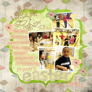
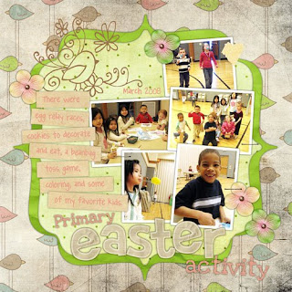
At first glance they may look the same, but if you look closely can you tell which one looks more realistic? You might notice that the second one has more depth and looks more like a paper scrapbook page would. This is because I applied drop shadows to the photos and most of the embellishments.
In Photoshop Elements you can apply a drop shadow to any layer.
1. Drop shadows are found just above your layers palette, in the section titled "Artwork and Effects". (This is what it is called in PSE 5.0, in other versions it may be called something different but it will be in the same place.) You will notice two drop down menus.
- For the one on the left, select "Layer Styles".
- For the one on the right, select "Drop Shadows".
You should then see six (or so) different boxes that give examples of drop shadows.
2. To apply a drop shadow to one of your layers, whether it be text, paper, or embellishment, make sure the layer you want is selected in your layers palette.
3. Now go up to your drop shadows. The only one I ever use is "LOW". You can a) click once and then go down a bit and click "apply", or b) double click on the drop shadow box. Your layer will have gone from this:
(no shadow, no depth)
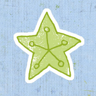
to this:
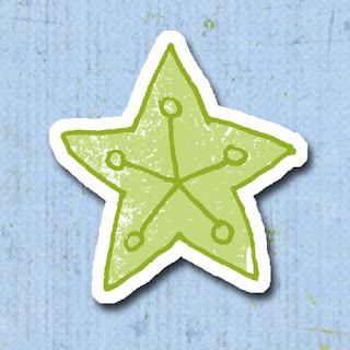
But as you can probably tell, this doesn't exactly look realistic either. It makes it look like the star is sort of "floating" above the paper, rather than attached to it. So let's keep playing with it.
4. You will notice in your layers palette that the layer you applied the shadow to now has a small icon on the right side. (In PSE 5.0 it looks like a little white sunburst.) Double click on the little icon.
5. A new window will open that gives you all kinds of options for customizing your shadow. The main thing I focus on is "Distance". You will see it has a slider and a box with a number. The default is 21. I usually change this number to 0. Here's the result:
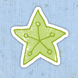
Now there is a hint of shadow but it looks like the star is now actually glued or attached to the paper. You don't have to set your distance to 0, but it is the number I use 95% of the time. If I ever choose another number, it is usually below 6. But play around with the slider or different numbers to get the effect you like.
Also, there are a few other options you can play with other than distance. You will notice there are sliders for size & opacity as well. I generally don't mess with these, but sometimes I reduce the opacity. Again, just play around until you get what you like. There is also the lighting angle at the top of the window. Sometimes I change this, but as you reduce your distance it doesn't really matter what you lighting angle is, the shadow will look pretty much the same.
Like I said, this is my number one tip for digital scrapbooking. So many digital layouts look so flat, but adding drop shadows gives it that realistic look with depth that you get with traditional scrapbooking.
{Easter layout credits: bird paper, green paper, flowers and bracket frame by Bren Boone, brads from Amy Teets' "Sunporch" kit, kraft paper (cut into strips), alpha, yellow tape & staples by Shabby Princess, chick doodle by Victoria Greenlees, "Love Ya Like A Sister" & "Pea Angedawn" fonts}
