Friday, April 11, 2008

Template Scrapping

Last night I made this layout...


Using this template:


I think I've mentioned templates before, but if you don't know about then you should. Template scrapping is becoming super popular and it's great when you are feeling less than creative, or you just want to get it done fast. Layered templates come in .psd form, which makes them different than just a sketch. I'm not just copying the layout, but each part of the template is on a separate layer, which means I can place the pictures, papers, and elements I want to show on each individual layer and make a clipping mask (ctrl+G). It's SUPER easy. To read more about how to do this go here or here.

The other good news is there are tons of great templates out there, many for free. Here's a few links for ya:

The template I used (seen above)

M Originals

The Digi Chick weekly template challenge

Ikea Goddess - she posts links to several free templates every day

Go get some templates and get scrapping! :)

{template from Digital Scrapbook Memories, flowers and papers from DSM's Mood CD "Playful" kit, "Myriad Pro" and "HVD Comic Serif" fonts}

Thursday, April 10, 2008

New York Girls Trip


Just some photos from a recent trip to NYC with some friends.

{background paper and paper flowers from "In Bloom" mini kit by Heidi Willimas at Weeds & Wildflowers Design, brads and staples from "Sunporch" kit by Amy Teets, journaling paper from "Pepsss Attitude" kit by July, bow from "Gingham Bows" by Fernlili's Designs, alpha from "The Promise Collection" by Shabby Princess, "Pea Lindsey Unicode" and "CK Ali's Writing" fonts}

Wednesday, April 9, 2008

Sgt Peppers Tribute


Last summer I went to a concert that celebrated the 40th anniversary of the Beatles' "Sgt Pepper's Lonely Hearts Club Band". I wanted to create a layout using these photos that reflected the mood and the style of the album and the psychedelic era of the sixties. I think when scrapbooking it's always important to try to tell the story using pictures, words AND art... all of these should be in line and combine to get the story across. I chose papers and elements and used techniques I felt reflected the emotion and feeling of this event.

The specific technique I used was the "linear light" blending mode. The plumes I used (found free here) were simple black and white brushes, so I used my paint bucket tool to fill them in with color. Then I changed the mode of each of those layers from "normal" to "linear light" (the small drop down menu found at the top of your layers palette).

I also used the "linear light" blending mode on the hand stamped alpha (also free, here). After completing the lettering, I made a duplicate layer, and set it to "linear light". The original layer I kept set to normal.

{paper from "Love-ly" kit by Leora Sanford, flourishes from "Hipster Plumes Freebie" by Anna Aspnes, wordart tag from "Good Times" kit by Jackie Eckles, alpha from "hand-stamped alpha" by Michelle Coleman}

Monday, April 7, 2008

Live, Online, and FREE digital scrapbooking classes!

Over at Digital Scrapbook Memories some new classes were just announced. Looks like two new intro classes (one in April, one in May), one focused on creating great layouts, plus the previously mentioned photo touch-ups class on April 19. To read more and get registered, go here. YAY!!!

Sunday, April 6, 2008

Ordinary Life: March

I got March done!


Find the album templates here.

{templates by Jessica Sprague, white paper by Leora Sanford}

Thursday, April 3, 2008

New Handwriting Fonts

Free of course! Found here.

Wednesday, April 2, 2008

Color Spotting Technique

I took a FREE online class I saw advertised on the DSM forum called "Picture Perfect". First off - if anyone's interested, I just have to plug the online classes they offer. They have a beginner class each month to get you started in photoshop, and they have just now started offering some advanced classes. You do have to call a long distance number to get the audio for the class, but it is so worth it. (And if you live in Philly like me, the classes are usually at 9pm and that's when free minutes kick in! Bonus!) You can find out more about the classes here and go to the "Online Classes" section of the forum to find the details.

Anyway, back to the Picture Perfect class. I learned so many COOL new things to try and share, including easy ways to enhance your photos, many different ways to change to black & white, boosting color, changing to sepia, antiquing, and more.

What I'm focusing on in this post is COLOR SPOTTING - how to get one part of a black and white photo to show color, as seen in this layout:
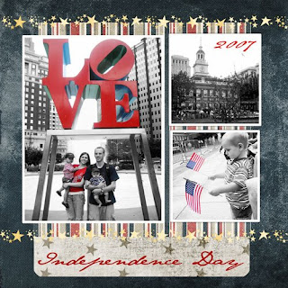


I'm going to explain how to do this but bear with me, I'm not always the best at explaining things, and it's still new to me ;)

1. Open your color photo, and do any editing you like.

2. Create a new adjustment layer. **This was a brand new thing for me** See the little icons at the top of your layers palette? On the far left you should see a small white square that looks like a piece of paper, and next to that is a circle - half black, half white. Click on the circle, and a drop down menu should appear.

3. From the list, click "gradient map."

4. A new window will open, with a black and white rectangle. Click on the the little arrow to the right of the rectangle and select the "black, white" square (third from the left).

5. Click ok. What you have created is a "black & white gradient map". Your photo should now look black & white.

6. Select your brush tool from your toolbox. From your options bar at the top of the screen, select a simple round brush.

7. Make sure your brush color is set on black. To do this go to the little square on the bottom of your toolbox (bottom left corner of your screen.) If the box on top is already black, perfect. If not, click on the box and new window will open. From the color box select a black section and click ok.

8. NOW - click your brush over the areas you want in color. It may be useful to zoom in close so that you can be very precise.
**If you mess up... just change you brush color to white and go back over the areas you want to fix - they will return to black & white. Basically, when you are working on a black & white gradient layer black means "NO (not black & white anymore!)" and white means "YES".

9. Once you have finished working on your gradient map adjustment layer, and your look is complete, merge the two layers. (Hold down your Ctrl key while clicking on both layers. Then right click on the layers and select "merge layers".)

So... I really really hope this makes sense for anyone who wants to try it. If you have any questions please feel free to email me or use the comments. My email address is lynnettelebaron at hotmail dot com, and it's also posted in my sidebar.

Join me for the next DSM advanced class on April 19, also focusing on photo editing! The class will cover things like teeth whitening, taking out distracting things in a background, switching heads (when the kiddos just won't cooperate) and MORE! (Alisha is an amazing teacher.)

{paper by Gina Cabrera's "Virtual Ink" CD, stars by Miss Mint at Peppermint Creative, "Jane Austen" font}